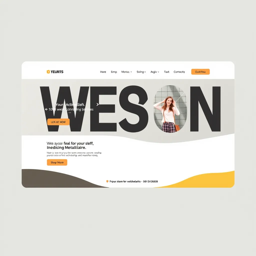
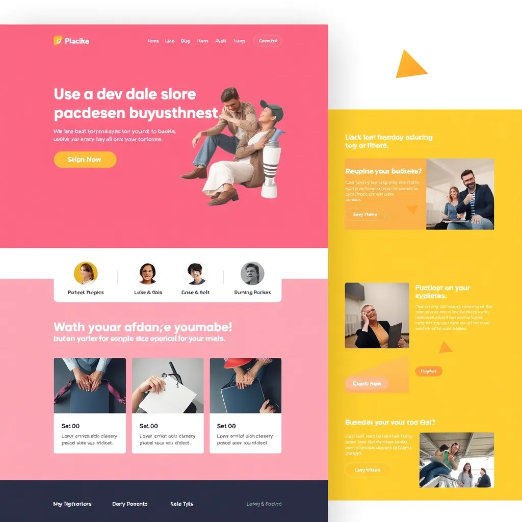
Responsive Web Design: The Key to Better UX and Traffic

Experience the future of web design with our cutting-edge responsive solutions.

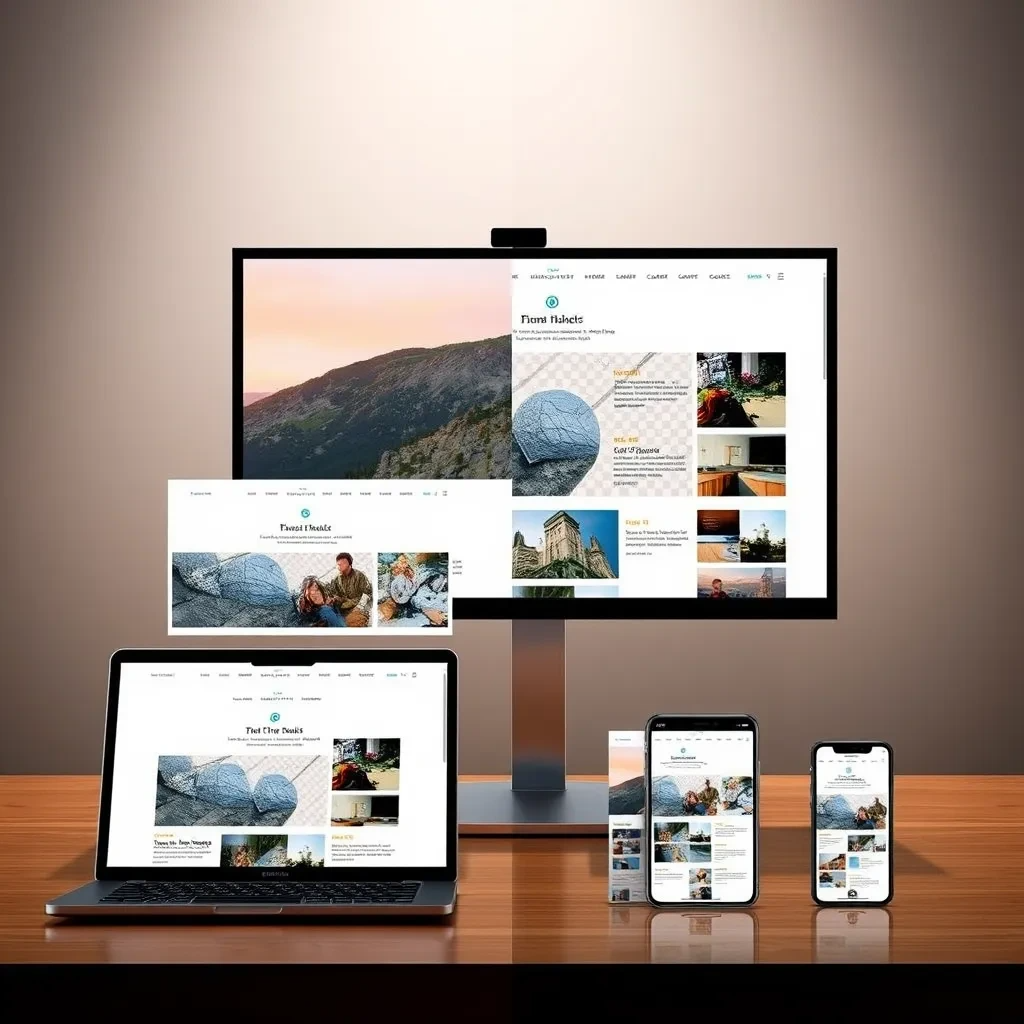
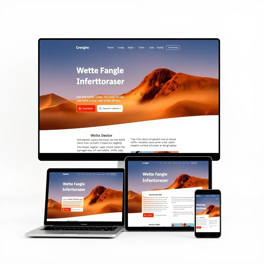
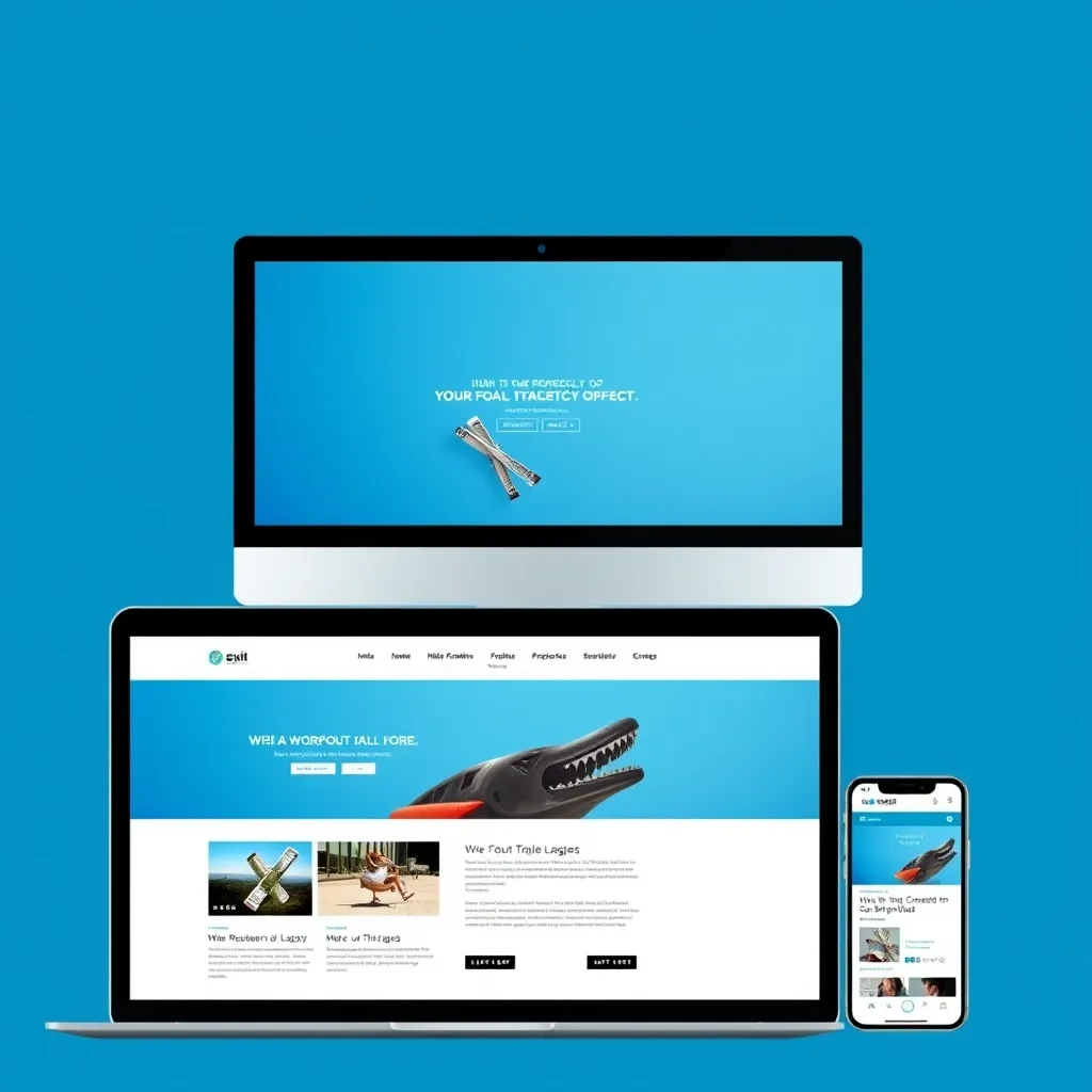
We craft websites that adapt flawlessly across all devices, from desktops to smartphones. Our responsive design expertise ensures a consistent and engaging user experience, no matter where your visitors are browsing.

Web Design

Responsive Design: Creating Seamless Experiences Across Devices

A split-screen image showing the same website layout across four devices: a large desktop monitor, a laptop, a tablet, and a smartphone. Each device should display the website content clearly and attractively, showcasing how the layout adjusts seamlessly for optimal viewing on each device.

Fluid Layouts for Optimal Viewing

Responsive design adapts to different screen sizes, ensuring content is easily readable and navigable on desktops, laptops, tablets, and mobiles.

A close-up image of a user interacting with a website on a smartphone. The image should highlight intuitive touch-friendly buttons and menus, demonstrating how responsive design ensures seamless navigation on mobile devices.

Intuitive Interactions for All

Design elements like buttons, menus, and forms are optimized for touch interaction on mobile devices, while maintaining a consistent experience across all platforms.

A comparison of the same website layout on a smartphone and a desktop computer. The smartphone version displays a simplified and prioritized version of the content, while the desktop version showcases a more detailed layout, demonstrating how content is prioritized for mobile-first design.

Content Prioritization for Mobile-First

Mobile-first design prioritizes essential content for smaller screens, ensuring a clear and concise user experience, while expanding on desktop versions.

Building a User-Friendly Website: Adapting to Desktop, Laptop, Tablet, and Mobile

A split-screen image showing a website on a desktop, laptop, tablet, and mobile phone. Each screen showcases a website with the same navigation bar and layout, but adjusted for the screen size. The navigation bar contains clear, labeled buttons.

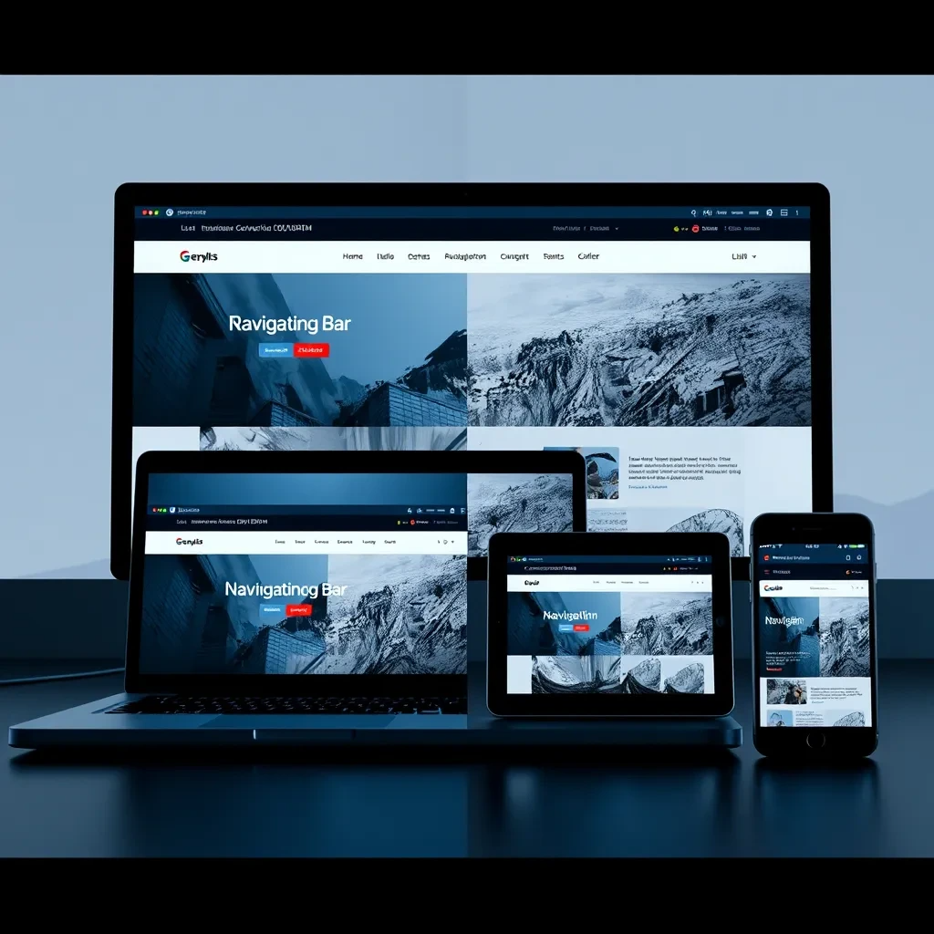
Consistent Navigation

Ensure a unified navigation experience across all devices. Clear menus and consistent button placement enhance usability and reduce user frustration.

A website landing page displayed on four devices - a desktop, laptop, tablet, and mobile phone. The desktop version shows a full-width image, while the laptop, tablet, and mobile versions show the same image adjusted to fit their screen size. Text on the desktop version is in a medium font size, while it gets progressively larger on the laptop, tablet, and mobile versions to enhance readability.

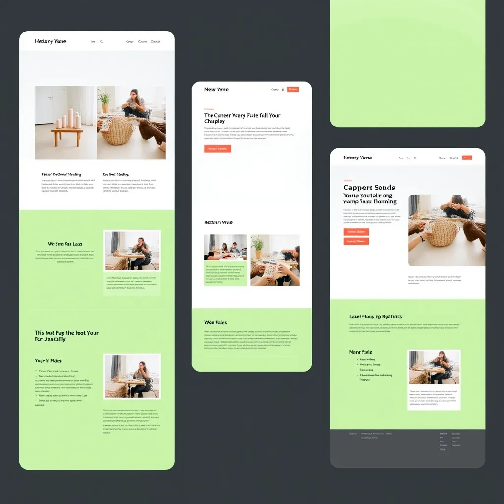
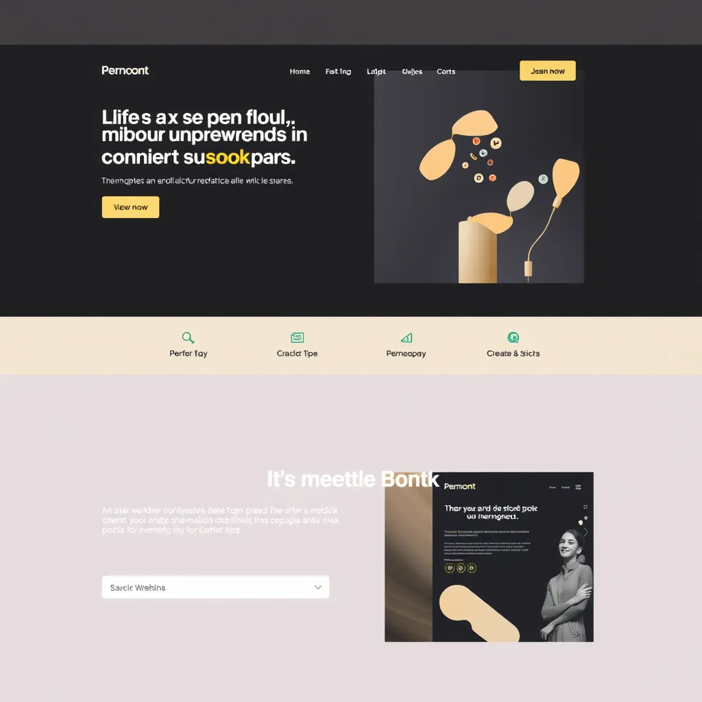
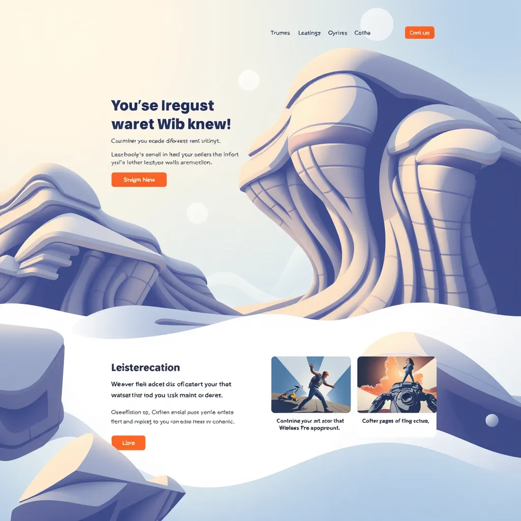
Optimized Content Display

Tailor content display for each device. Adjust text size, image scaling, and layout to prevent overcrowding or excessive scrolling.

A photorealistic image showing a hand interacting with a mobile phone screen. The phone displays a website with a prominent, brightly colored call-to-action button, making it easy to tap for the user.

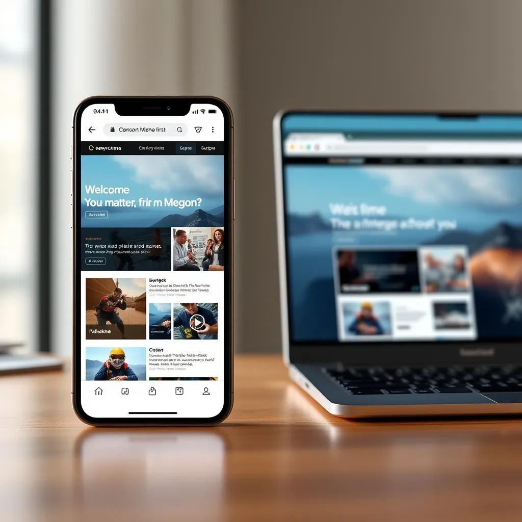
Intuitive User Interactions

Design touch-friendly interfaces for mobile devices. Use larger touch targets and avoid complex gestures to facilitate seamless interaction.

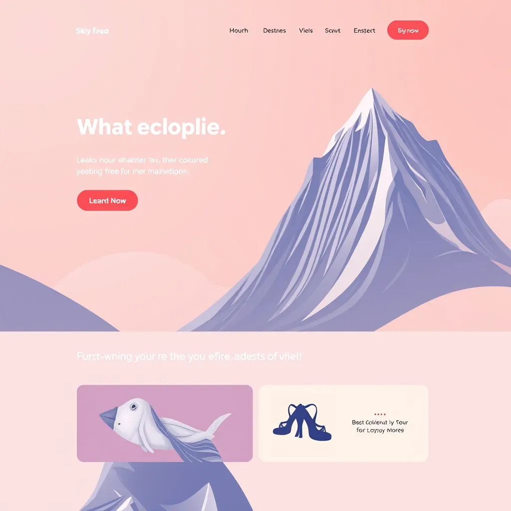
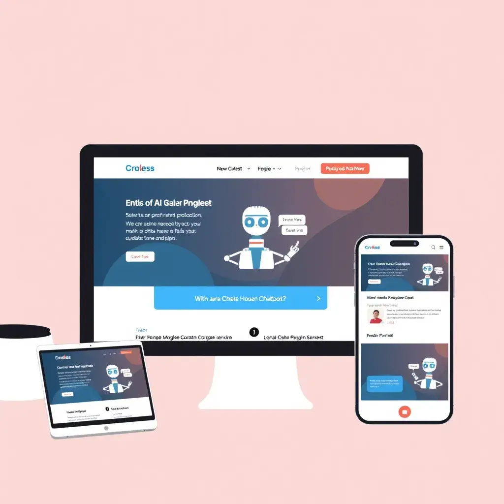
The Future of Website Design: Responsive Design for Optimal User Experience

A split-screen image showing a website displayed on a desktop, laptop, tablet, and mobile phone. The website layout adapts perfectly to each screen size, showcasing seamless transitions and an optimal viewing experience across all devices. The background is a vibrant blue, and the website content is clean and modern with high-quality imagery.

Seamless Transitions Across Devices

Responsive design ensures a consistent and enjoyable user experience, regardless of the device used to access the website.

Enhanced User Engagement and Conversion

Responsive design optimizes the user journey by making content easily accessible and engaging, leading to higher conversion rates and improved user satisfaction.

A vibrant, modern office setting with a diverse group of people using various devices to access a website. The website displays engaging content, interactive elements, and clear call-to-actions that encourage users to take action. The scene is filled with positive energy and a sense of progress.
A futuristic cityscape with sleek buildings and advanced technologies. In the foreground, a person wearing virtual reality glasses seamlessly interacts with a website that adapts flawlessly to their immersive experience. The website design is innovative and futuristic, representing the adaptability of responsive design for future technologies.

Future-Proofing Your Website

As technology evolves, responsive design remains essential for future-proofing websites, ensuring they are accessible and perform well on emerging devices and platforms.

Responsive Web Design: What Our Clients Say

Since switching to a responsive website, our online sales have skyrocketed! It's so easy for customers to browse on any device.

Noah Jones

My website looks amazing on all devices, and my customers are impressed. It's definitely worth the investment.

Mateo Evans

I was worried about the cost, but the team at Sacko Consulting made the whole process smooth and affordable. I'm so happy with my new responsive website!

Emma Taylor

Reach every screen, every time with our responsive web design. Say goodbye to clunky layouts and hello to seamless user experiences on any device.

All rights reserved | © Copyright 2024